The forms provide a set of standard fields and functions that are always the same to use, even though they may support different content functions.
Usually, each form has the following buttons at the top:
•OK: Closes the form, saving any changes made.
•APPLY: Saves the changes made, the form remains open.
•CANCEL: Closes the form without saving it. If there are unsaved changes, the system will ask you if you want to exit the form without saving.

In some cases, the buttons have other text behind them to indicate a specific function.
The most important available field types on forms and their operation are listed here:
Input field (single-line)
Single-line input fields are fields that expect text or numbers as values. Sometimes, these inputs are also provided with a button right next to them with an action.

Text fields (large, with text editing)
These are classic description text fields for entering larger, multi-line texts. Through the common formatting options above, the text can be marked and edited accordingly after the input. By pressing the "Image" icon or via "Copy & Paste" from the clipboard, image files can also be inserted into the text.
In connection with the comment function on some forms, the description text field is also used to create a new comment. Then, the entered text is not stored in this field, but in the comment history below it.

Date and Time fields
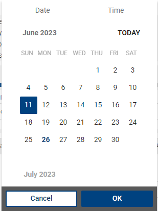
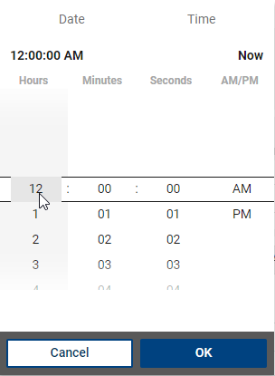
Date and time fields are used to display an automatically set time value or for own input. The date as well as (optionally) the time can be entered. The time can be entered after the date (format DD.MM.YYYY) with spaces in the format 00:00:00 or via the drop-down field next to the field directly above the date or time picker (in the drop-down menu).


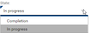
Selection fields (simple drop-down list)
Selection fields allow the selection of a value from a predefined list. Sometimes, the selected value can be used with a function (button right next to it).

Selection fields (reference fields)
If a selection is used to select not only from a predefined, smaller list, but from a complete object list, and if this selection is linked to the form (simple linking), reference fields are used. Reference fields have a selection list with the following functions (the relevant object type is usually specified here as well):
•Open referenced object: If an object is already linked, you can open it directly via this button.
•Add reference to existing object: You go to the defined target list, and you can select the desired object there using the search and filter option and create a link by double-clicking.
•Remove reference to object: Removes the link to a previously referenced object.
Depending on the type of field, the most likely action is always displayed immediately next to the field. The list may also contain other specific actions if necessary.
|
Note: Reference fields always allow a direct search for the most important field in the reference object. In the case of reference fields that link to a person (reporting person/affected person), the last name or the beginning of the last name can be typed directly into the field and, after pressing the "Enter" key or "Tab" key, the matching object is linked immediately, if it is unique. If several matches are possible, all matching suggestions are displayed in a drop-down menu. For other reference fields, e.g. "Category", the title is searched for. |
Reference list
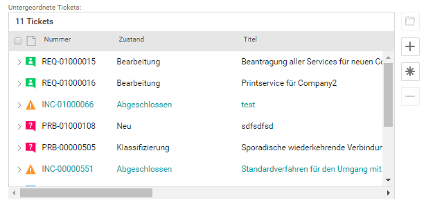
Similar to a simple selection field, a selection list can link several objects in the currently opened object. The actions available in the reference are also displayed next to or above the list. The "+" symbol allows you to add an existing object (the corresponding object list will then open for selection). The "asterisk" icon creates a new object and links it. The "minus" symbol removes selected links from the list (but does not delete these objects). Depending on the list, further buttons are offered. These usually work after marking one or more entries in the list and execute a certain function on it.

Attachments
The function with which you upload attachments or open existing attachments has the same structure in every form. Sometimes, the attachments are arranged on a separate form section or together with other fields.
Via the button files can be added via drag/drop or selected from the explorer. Furthermore, a local hyperlink can be added if a file is too large to upload. Multiple files can also be selected and uploaded or linked in one go. Several files can also be selected and uploaded or linked in one go.
All existing attachments are listed in the attachment field. Clicking on the entry opens the attachment. The corresponding buttons can be used to change the description texts of selected attachments or to delete the attachment.
As an alternative to the dialog for uploading a file, you can also use drag & drop to "drop" files directly above the attachment field and thus upload them. In some browsers, however, not all file types can be uploaded using drag & drop.
|
Note: You can upload an unlimited number of attachments, but only files with a maximum of 10 MB each. |
Mandatory fields
There are defined process-dependent mandatory fields. A mandatory field can already be filled, or it must still be filled.
Mandatory fields that have not yet been filled are highlighted in bold font and, depending on the field type, are also outlined in color. If you try to save the form without the mandatory field being filled, the system will indicate the missing entries by listing the mandatory fields that still need to be filled.

In addition, the title of the form section indicates whether there is a mandatory field (filled or not filled) in this section.
Depending on the defined rules, some fields and functions have read-only access, i.e. they cannot be changed. In this case, the displayed contents of the fields and field functions are slightly highlighted in light gray.